Managing pages
If you created a space, you can now add pages. They are customised views for your data that enable you to build a website for your project.
Table of contents
Adding a page
To create a new page, follow these steps:
- Navigate to your team dashboard.
- Select the space you want to add the new page to by clicking on a space card.
- Then click on the “+ Page” button in the top left corner.

- Fill in the name and the path of your new page.
- Optionally, if you have more than one space, you can change the space of the page is added to, you can select it from the space field.
- Press the “Add” button to save the new page and to get redirected to the page editor.
Editing a page
Editing a page is simple to do even if it works differently than other data on our platform. To open the page content editor, you need to:
- Navigate to the space dashboard, which contains your page
- Identify the page card that you want to edit
- Click on the card title
Or, if you can access the space through a URL you set up, you can:
- Go to your space’s URL and log in with your account
- Navigate to the page that you want to edit
- At the top, there’s a black menu that’s visible only to your team. Click the “Edit Page” button.
Once you followed those steps, you will see something like this:
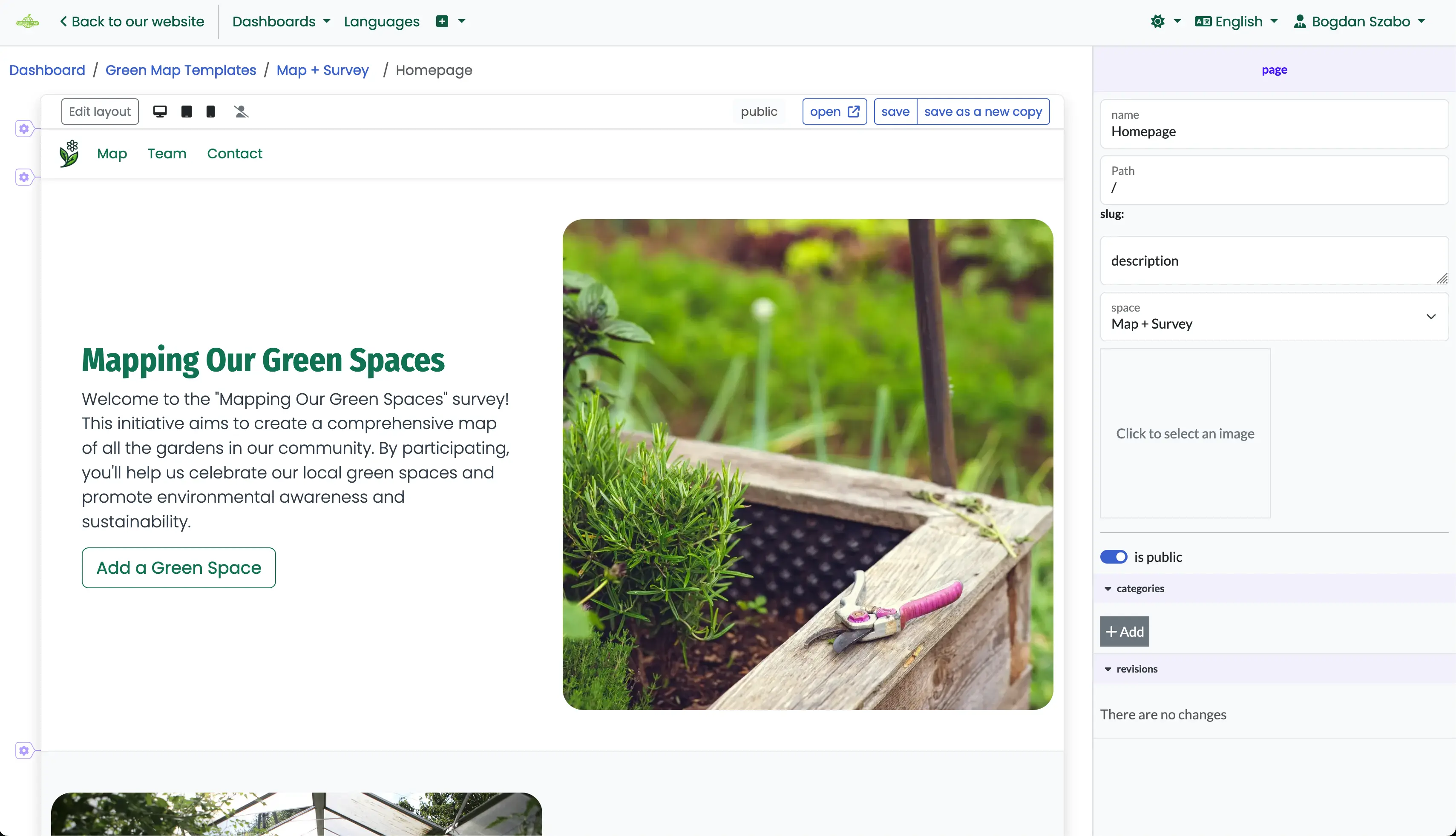
Edit the page information
The page info section has fields that allow you to set how the page is viewed and accessed by the public. To edit it, you need to click outside the page editor, just like in this example:
To help you better understand what each field does, here is a list with explanations:
- Name is used in various places. The most noticeable is the page title displayed on your browser’s tab. It also appears on the dashboard card and when sharing the page on social media.
- Path is the part of a URL that determines where a page can be accessed. It must be unique within your space to ensure each page has its own web address. If you use an
:idvariable in the path, it allows the page to display specific content based on the provided URL. For example,/:feature-idwould search for a map feature, which can later be connected to data source properties. - Description provides a brief summary of the page’s content. It is displayed on the page card in the dashboard and shared on social media. However, if the path includes a variable, the description will only appear on the card, as social media will use the article from the selected record instead.
- Space is a reference to the space that owns the page. This useful when you want to move a page from one space to another.
- Cover is shown on the page card, and on the dashboard. For the pages without id variables, it will be used on social media too.
- Is public this controls if the page can be seen by everyone or only by members of your team.
- Categories contains the tags associated with the page. For instance, if there are multiple :article-id pages, it may be difficult to determine which one should display the article. In case of a conflict, the page that shares at least one category with the article will be selected.
Your changes won’t save or apply right away—you’ve got to hit that save button first! Don’t forget, or your hard work will disappear faster than a snack in the office kitchen.
Edit the page layout
If you began with a template for your website, you typically won’t need to adjust the layout unless you plan to add more content to the page. If you don’t intend to do this, you can skip this section.
The page layout acts like the backbone for adding the components that show your data. It’s built using the Bootstrap framework. If you want to dive deeper into how it works, check out the layout section on their site. We’ve also included some handy options from their flexbox classes, and you can find more about that in their docs too.
The Bootstrap layout model is a flexible, responsive system built on a 12-column grid. It uses containers (fixed or full-width) and rows to organize content into columns that adapt to different screen sizes with predefined breakpoints (like sm, md, lg). Built on Flexbox, it offers powerful options for alignment and spacing, ensuring content is well-structured across devices. You can control column widths, use auto-layout for equal columns, and adjust spacing with offsets and gutters for precise layouts.
Our layout uses 3 breakpoints: mobile, tablet, and desktop, and it follows a mobile-first approach. This means we start by defining styles for mobile screens, and as the screen size increases (like tablet or desktop), we layer on more styles. If you don’t set a specific style for larger screens, the styles from the smaller screen will automatically carry over.
To access the layout editor, click the “Edit layout” button at the top of the page editor:
Adding your layout components
Before jumping into adding your layout, it’s smart to sketch a rough design on paper or with any tool you prefer. When you’re ready, start by adding containers.
Containers
Each container should hold one distinct section of your website, like the main menu, footer, a single article, or anything else you think should be a separate unit. To work with the containers, you have on the left some control buttons:
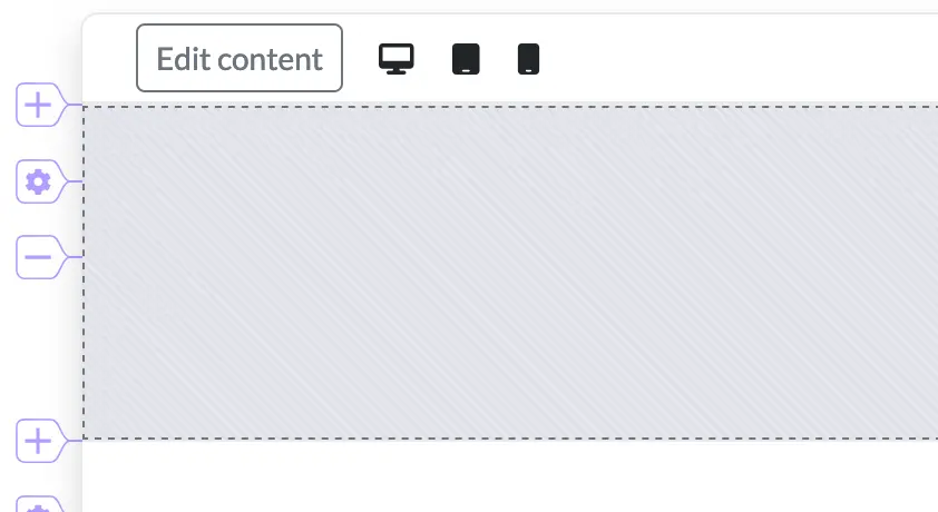
- a plus button that allows you to add a new container
- a config button that allows you to change the container properties
- a minus button that allows you to delete a container
To change a container’s options, press the config button for that container, adjust the settings on the right panel, and then save your changes.
Here is an explanation of all the container options:
Style
- width lets you set how wide the container is. By default, it has a fixed width for each device. If you want it to stretch from one edge of the screen to the other, just set it to fluid.
height lets you set the container’s vertical size. By default, it adapts to wrap the inner content, but if you want it to occupy all the unused space, set this to fill.
paddings set the css padding for the container
the min height property defines the minimum height of the container as a percentage of the window size. If the content exceeds this specified height, the container will expand to accommodate the larger content.
- the justify content property controls the alignment of rows, with options that correspond to those available in Bootstrap.
Layers - this section enables you to stack background or foreground components alongside your page content.
Count represents the number of layers that you want to set up
Show the content after indicates the position of your content layer in the stack. If you configure 3 layers and set this to 2, it means your content is placed between 1 background layer and 1 foreground layer.
Effect allows you to apply custom effect to your container.
Options
visibility allows you to set in which conditions the container is visible.
anchor allows you to set a link anchor to the container, enabling users to jump directly to this container when the link is clicked.
Rows
A row is a horizontal wrapper for columns. It helps keep everything lined up and spaced out. You use rows to organize your content into columns, and the grid system makes sure it looks good on any screen size.
Here’s a good rule of thumb: group all the columns you want on the same line into a row for the largest screen size. Think of it like a board meeting—if you want everyone to fit at the table, you’ve got to arrange those seats (or columns) just right, or someone’s going to be left awkwardly standing!
By default, each container includes one row when you add it. When you select a column (we’ll cover this in the next section), blue row control buttons appear on the right. These buttons let you add a new row either before or after the selected one, or edit the row’s settings. Here’s how these buttons work:
Here is an explanation of all the row options:
- min height defines the minimum height of the row as a percentage of the window size. If the content exceeds this specified height, the row will expand to accommodate the larger content.
- vertical gutters sets the spacing between the current row and the previous row.
- horizontal gutters keep your columns spaced out evenly, so content doesn’t get squished together. The grid system takes care of this automatically, but you can tweak the spacing for each column if you want to.
- justify content allow you to change the horizontal alignment of columns.
- align items allow you to change the vertical alignment of columns.
- visibility lets you control whether a row is shown or hidden on different devices. For instance, you can use it to display a specific design on mobile devices while hiding it on desktops, or vice versa. This helps tailor your layout to different screen sizes.
To delete a row, you need to remove all the columns inside it:
Columns
A column or simply a col is a flexible container inside a row that holds content. The grid system uses 12 columns to help organize and adjust content width across different screen sizes.
The 12-column layout helps by providing a flexible and consistent way to divide and organize content. It’s easy to create various column widths and arrangements by combining the 12 columns in different ways, like 1/2, 1/3, or 1/4 of the row. This flexibility ensures that your design can adapt to different screen sizes and maintain a balanced, responsive layout.
When you create a row it will already contain a col. To add more columns in a row, select one column and the use the + control button at the end of the row:
To delete columns press the - button:
To edit the col properties just click on one to reveal the properties on the right side. Here is an explanation of all the column options:
- name gives a column a label to help you identify its purpose. Each column name must be unique within a page.
- component count represents the number of components that you want to add on this column.
- component margin is handy when you have multiple components within a column, as it lets you set spacing between them.
- display mode lets you adjust how the component container is rendered, affecting whether the items inside the column are arranged horizontally or vertically.
- order allows you to rearrange the sequence of columns. This is useful for changing how columns are displayed on different devices, like moving columns around for a better layout on mobile or desktop screens.
Your changes won’t save or apply right away—you’ve got to hit that save button first! Otherwise, your hard work might disappear faster than a volunteer who’s been asked to handle the paperwork!
Edit the page content
The page editor lets you pick which data records to show, update containers, and style the content however you want. You can also tweak different layers, like page properties, container backgrounds, and the look of rows and columns.
The page properties
The page properties show up in the property bar whenever you don’t have anything selected. To deselect something, just click outside the page frame, like in this example:
You can find an explanation for the page options in the Edit the page information section.
The container background options
To change the container background, just click the container options config button:
After that, you’ll see the background component picker. From there, you can pick a background color, image, map, or even remove the current background.
Here’s a breakdown of each option:
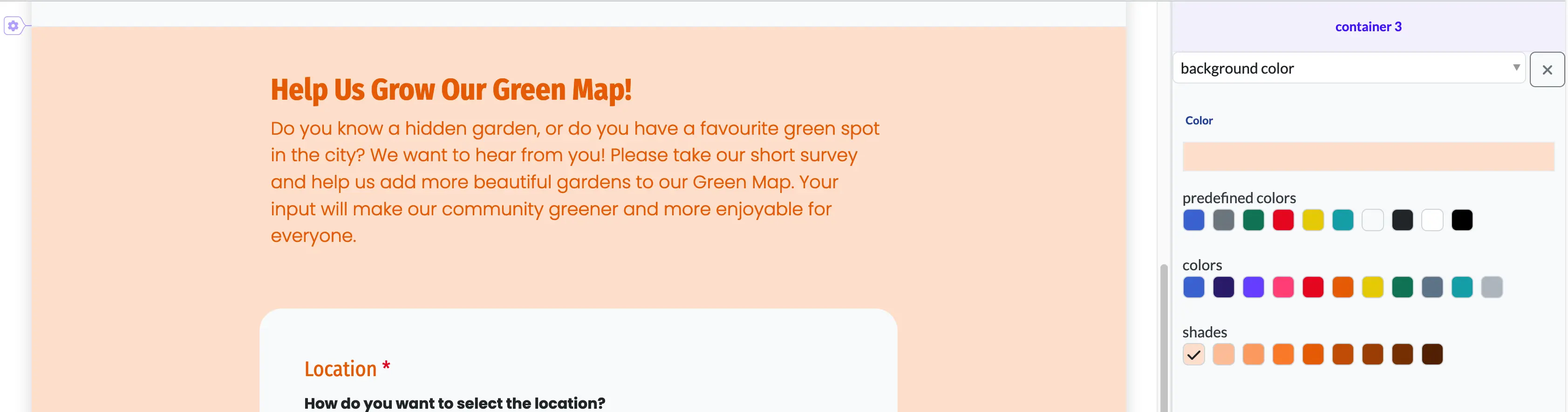
Background color
When you select the background color option, a color picker will appear. Just choose the color you want, and it will be applied to the container’s background. If you want to learn more about the color picker check this article.
Background image
When you select the background image option, an image upload box with its properties will appear.
The available options for this component are:
- Repeat controls how a background image is repeated (or tiled) across the background area, with options like repeat, repeat-x, repeat-y, no-repeat, and space or round for more specific tiling behaviors.
- Size property defines the dimensions of the background image, allowing it to be resized or scaled within the element’s background, using values like auto, cover, contain, or specific lengths and percentages.
- X and Y alignment properties specifies the starting position of a background image within its container, using keywords (like top, center, bottom)

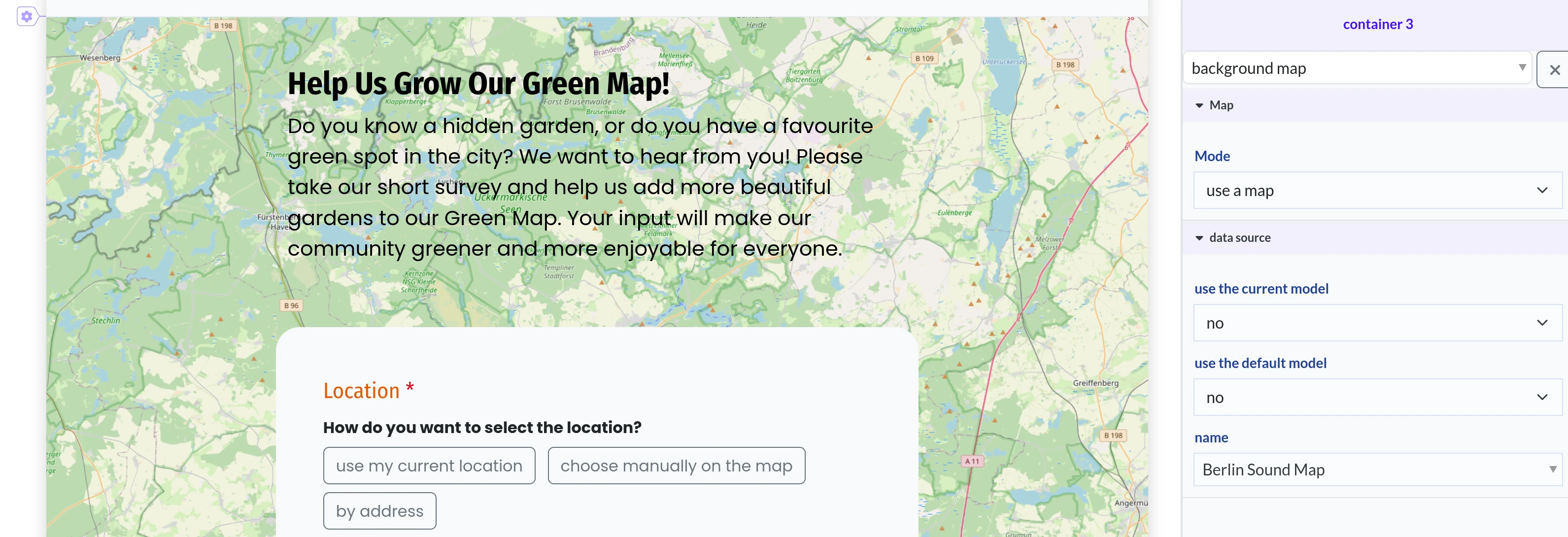
Background map
When you select the background map option, an option for selecting the map mode will appear. If you use this component, most probably you will use it with the use a map mode.
In this mode, you can choose the map you’d like to display as the background. For more details on selecting the data source, refer to this article.
Your changes won’t save or apply right away—you need to hit that save button first! Otherwise, all your hard work could vanish quicker than Wi-Fi at a crowded café!
Editing the column properties
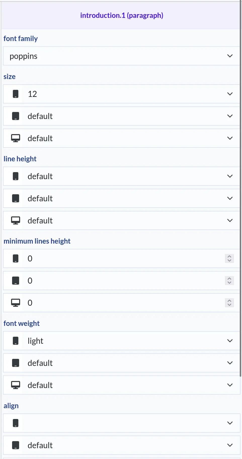
You can customize various property types for each layout, including metadata, displayed data, font styles, and covers. Before making any changes, you’ll need to select the corresponding editor. Here’s how:
Hover your mouse over the section you want to edit. Different highlights will appear, each with one or more titles:
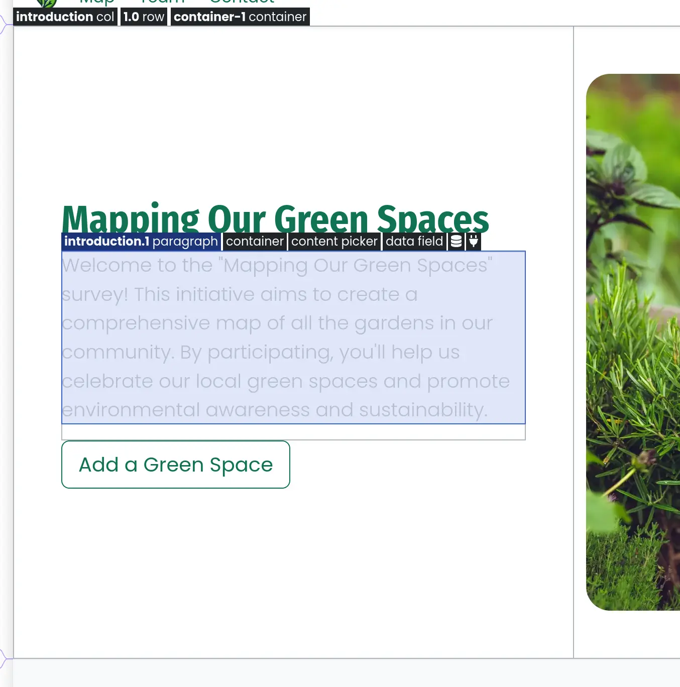
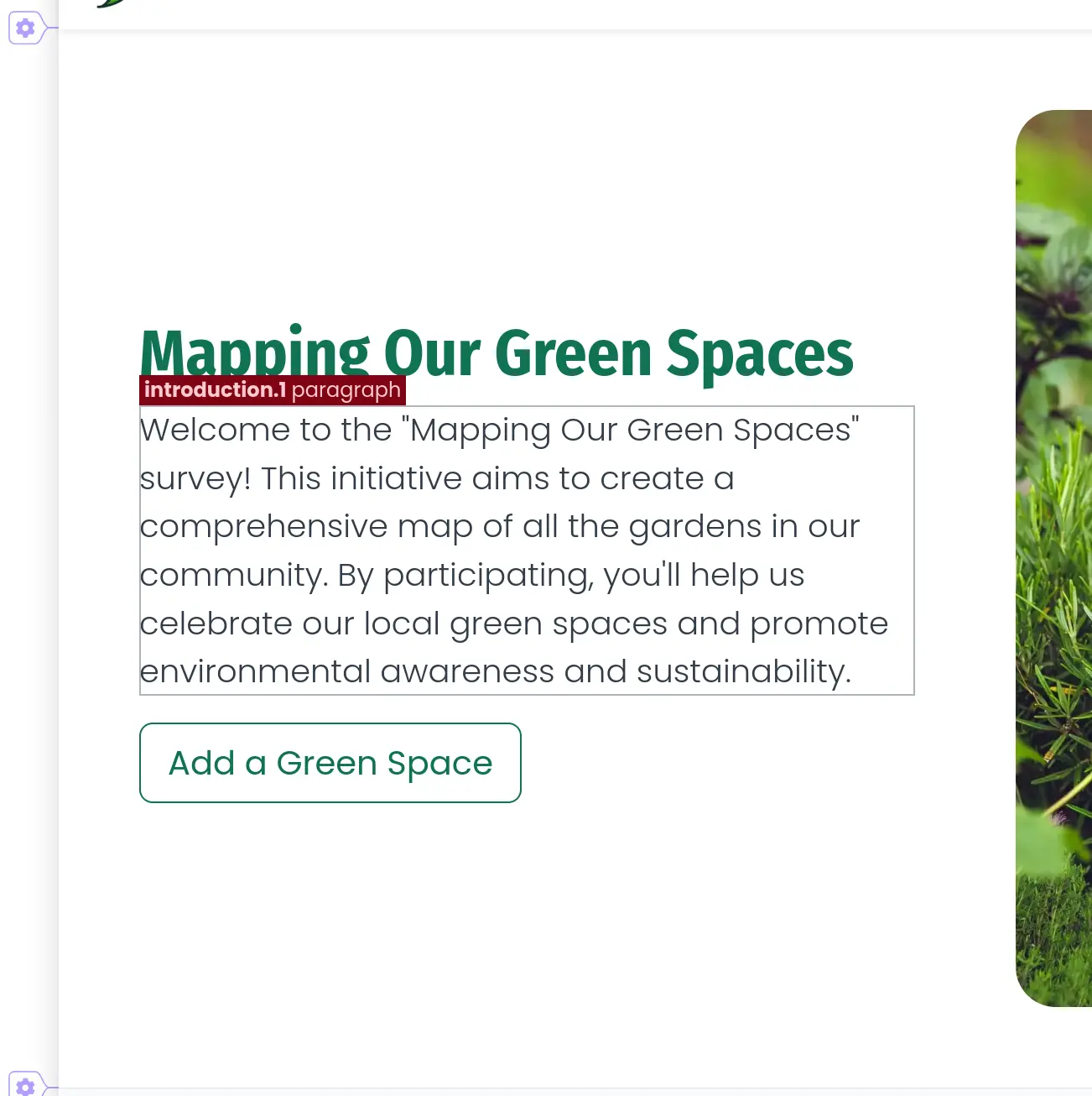
Click the header for the properties you want to adjust. The headers can be small and tricky to click, so for more precision, hold down the ALT key (on Windows and Linux) or the Option key (on Mac) to freeze the highlights. You’ll know it’s selected when the color changes and no other highlights are visible:
Undestarding the highlight titles
You can glean a lot of information just from the appearance of a component, even before interacting with it. The standard heading is displayed as follows:

Section Name: This is represented in bold text and can take on several formats:
Container: Always labeled using the format container-{index} (e.g., container-1).
Row: Labeled in the format {container index}-{row index} (e.g., 1-0), indicating “the first row in the second container” (note that indexing starts at 0).
Column: This carries a custom name specified in the layout editor. If you see a .{index} at the end of the name, it indicates multiple components are displayed within one column.
Editor type: This is represented in light text or an icon. The icon is used for the “data source” and “slot” editors.
To shorten the headers, if there are two or more adjacent titles with the same section name, it will only be displayed once, next to the first title.
Undestarding the editors
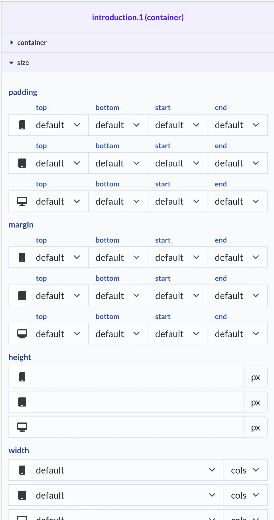
The property editors are always displayed on the right side. They always show information, whether or not you have made a selection. If no selection is made, the page properties are displayed; if a selection is made, the properties of that selection are shown.
The panel header displays the section name and the editor type. Below, complex editors organize properties into grouped sections, while simpler editors may not display these sections. Here is an example of some few editors:
Deleting a page
A page can be deleted only if you have edit rights to it. This means that you created it, or the page belongs to a team in which you are an owner. To delete a page:
- Navigate to your space dashboard.
- Press the three dots button on an page card to open the context menu:

- Press the
deletebutton. - You will be prompted to confirm the action:

- If you press
Yes, the page will be deleted. Note that you won’t be able to recover it later.